Canadian National Railways brand identity
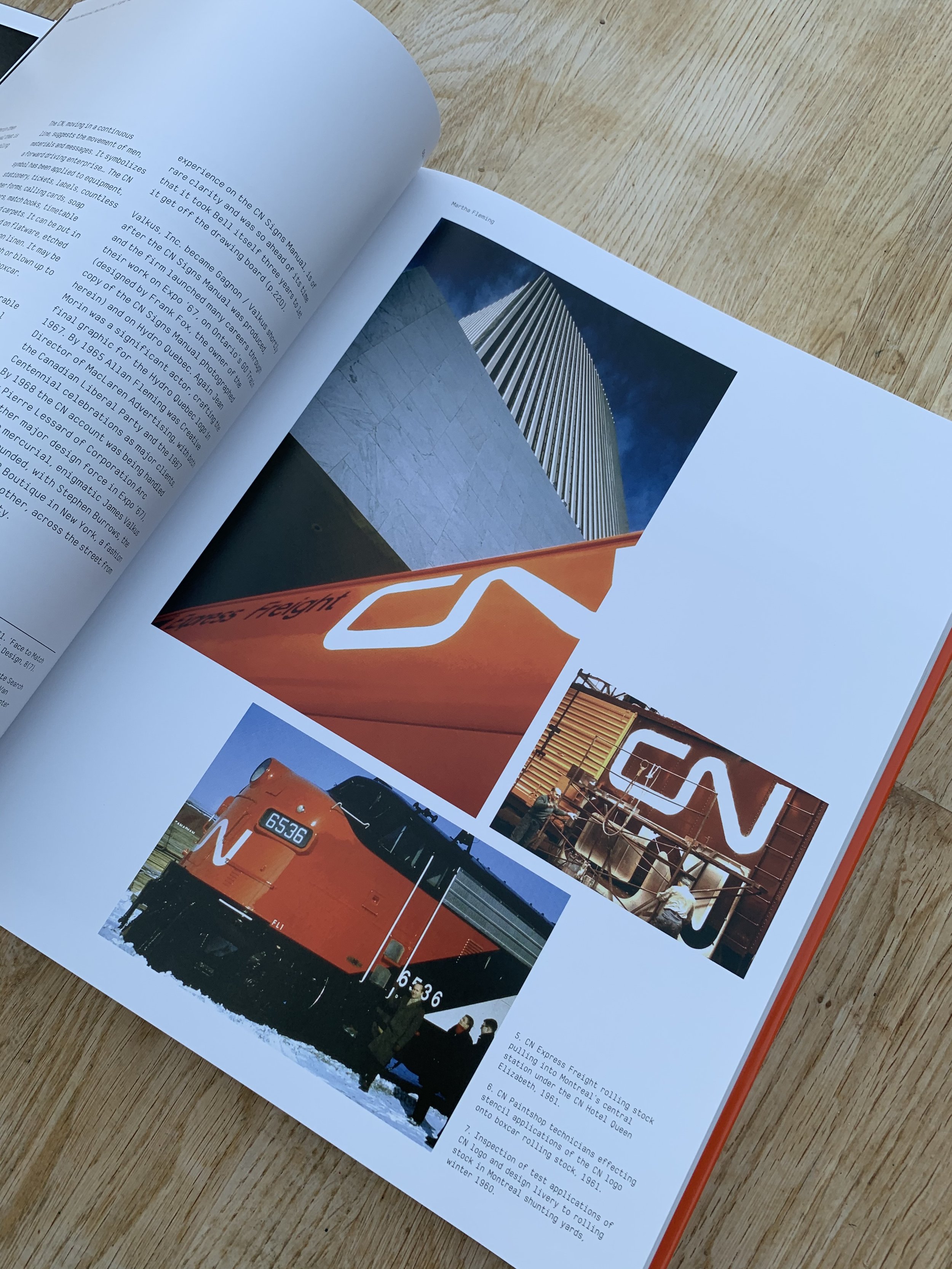
Commissioned in 1959, this superb identity is still in use to this day. Over and above its aesthetic appeal it works at massive & tiny scale, is legible when in motion and even works on corrugated surfaces. What a challenge to implement across a 4000 mile coast to coast route and 140,000 employees with the tech available in that era.
Railways were the new high growth, high tech sector of their era. CN traces its origins back to 1832 when the Champlain and St. Lawrence Railroad was incorporated. Over the following 129 years (up to 1961) there were endless mergers & acquisitions, name changes, logo changes and business diversifications. The company was large and complex and suffered its fair share of trials and tribulations. Its outward facing identity reflected all this - ever changing and slightly confused. Previous logo iterations included a ‘tilted wafer’ shape, a moose head and a maple leaf.
By 1959 Canadian National Railways (as they were now known) had rebuilt themselves after the ravages of WW2. Senior management perceived Canadian National to be new, forward thinking, customer-friendly and technologically advanced. However research revealed the exact opposite with the public. Even worse, they were seen as hostile to innovation.
Canadian National briefed James Valkus (a New York designer) to look at a new logo. Valkus realised they needed something much wider - an all encompassing visual identity system.
Of course the new logo would sit at the centre of the identity system. Yet it needed to bridge 2 seemingly competing requirements - blending perfect aesthetics with absolute practicality of application.

Valkus briefed the design challenge to Allan Fleming, a young Canadian designer. Whilst on a flight to New York, Fleming sketched the germ of an idea on a cocktail napkin - and from there the CN logo was born. Perhaps Fleming had partaken of a few cocktails prior to his eureka moment :)
Without the word Railways the new logo could be used across the new areas which the company had diversified into - eg hotels, telecoms and ferry services.
In their January 1961 launch to employees through their company magazine they said “our single biggest need is to overcome the notion that we haven’t kept pace with the times. No industry can afford to invest a billion dollars in product development without giving some attention to the packaging in which the product is marketed. Visual redesign simply amounts to restyling our package to suit and do justice to its contents.”
There are some important considerations from this story:
There needs to be a really solid reason to rebrand
Once you take the decision to rebrand, think it through properly
Ensure the scope of the brief is crystal clear (they thought they just needed a new logo but they actually needed a a complete brand identity system)
Design creativity plays a big part, but will you recognise it when you see it
The implementation is crucial. Just because you have a set of brand guidelines does not mean that things design themselves.
There have been many other iconic brands who’s logos have evolved over time (eg CocaCola). Yet the design of CN’s logo was so good that it hasn’t had to change at all since 1961. Plenty of the design variables around it will have evolved with the times (eg photography, copywriting style and use of illustration). The value in that brand continuity is immense.
Over the past few years there has been a move for corporates to simplify their logos with a view to increased digital use on mobile (eg Instagram, Juventus and VW). CN was way ahead of its time in this respect.
You can read more in ‘Manuals 2 - Design & Identity Guidelines’ published by Unit Editions. A book which we contributed to.
Huge credit to Allan Fleming, James Valkus, & Jean Morin.
