Invest in Nottingham
Less is more
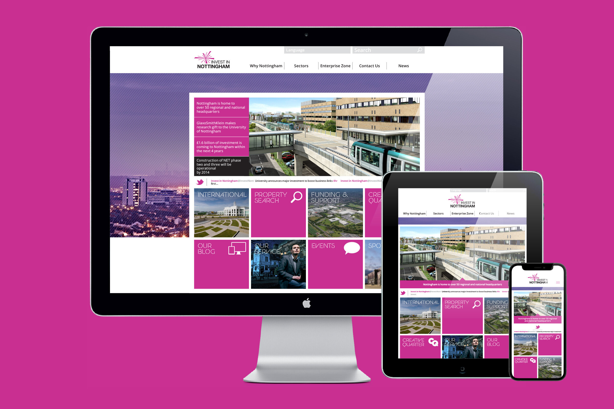
Most inward investment websites fail because they bombard users with information which has no clear hierarchy. Overall this new design aims to reduce clutter, project clear thinking and confidence. But it must also have visual impact along with its functionality.
It’s designed to be simple to use with a mixture of top navigation, sliders and eight pressure panels to direct users to the main content areas. A mixture of imagery and vibrant colour give the site a modern clean appearance. Sector navigation uses a new colour palette to further aid navigation. Colour coded icons are used as links to documents, news, maps and other sites. Icons take up less space but give clear routes to more relevant information.


Branding
Website