The Mid Yorkshire Hospitals NHS Trust
Multi site restaurant & cafe brand identity delivers stunning results
The Mid Yorkshire Hospitals NHS Trust is a big complex beast. Almost 9,000 staff spread over 3 huge sites, a turnover north of half a billion - serving half a million people.
The Trust was taking back control of certain ‘soft facilities’ - as specific Private Finance Initiative (Pfi) contracts came to an end. Their cafes and restaurants are 2 such facilities with the Trust once again gaining full control over how they deliver these services.
With planned patient admissions at almost 250,000 per year and A&E visits adding the same again, along with friends & family - these are continually busy operations running day and night.
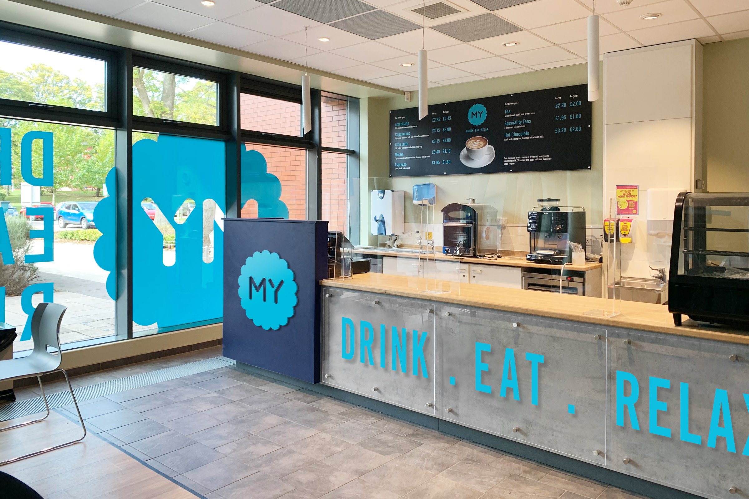
The existing identities for the cafes and restaurants needed to change completely to avoid any intellectual property issues from the previous pfi contracts. It also drew a line in the sand to show that these services were changing for the better.
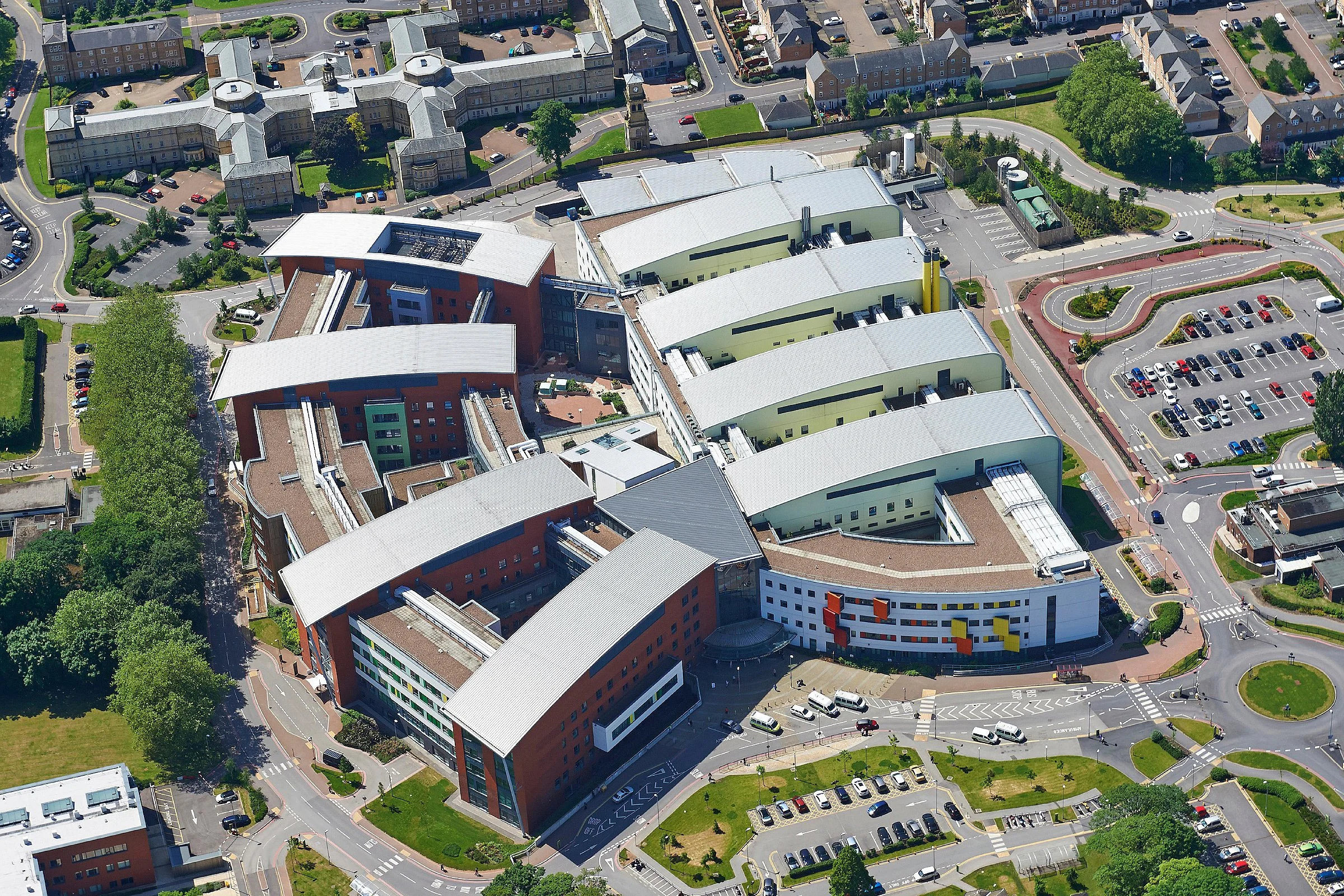
Our challenge was to create a brand identity for both the cafes and restaurants which would work across all 3 sites. The sites were diverse in terms of; scale, age, available space, physical limitations, ownership of certain elements, available light and surface materials.
Visiting all the sites and taking the right kind of photos was crucial, giving us, not only a visual reference for the canvas we had to work with, but also enabling us to present ideas shown in situ.
Starting with the name, everywhere you look in a hospital setting there are really long words; neuropsychology, cardiovascular, ophthalmology, gastroenterology, rheumatology, urogynaecology. All this housed within ‘The Mid Yorkshire Hospitals NHS Trust’ - we were in danger of drowning in letters.
Hence our chosen name…
MY
Short for Mid Yorkshire.
Best to zig when others zag.
We’ve carried this approach through everything, simplifying messages and using more concise language wherever possible.
We also had to consider the cafe & restaurant relationship. At the Pinderfields site the cafe is near to the restaurant but they are separate entities. So visually they needed to look related - yet distinct.
Although the Trust wanted to place its own stamp on the cafe and restaurant services - we needed to be sensible with budget. Our ideas were designed to work with as little disruption as possible within the existing physical set up. So graphical changes (signage, vinyls, images, fabrics, paint etc) which would work in harmony with the existing structure.


In the one space where physical changes had been sanctioned we worked in partnership with the architect to make sure the new brand identity was applied in the most creative yet consistent manner.


Uniforms had no such constraints and we were able to select styles of garment which also delivered on a functional level. Moreover we obtained samples to ensure that screen printed colours and embroidered elements matched the new brand identity perfectly.
Creativity, design development and approval are one thing. Application presented a whole different challenge. This presented a logistical challenge for hundreds of items which all needed specifying for; size, material, finish, production method and their means of attachment.
Having signed off on the individual items we commenced manufacturing (using acrylic, vinyl, fabric, metal, wood and card). With the final task being to install everything with the minimum of disruption, safely in a working hospital environment.

Was it all worth it?
The drink.eat.relax experience for both staff and visitors has been vastly improved. And takings have gone through the roof.
Branding
Interior Design
NHS